Advertising and Marketing: Key conventions
1) What key conventions of print adverts can you find and what are the connotations or deeper meanings of each convention? For each convention, write about how it communicates meaning to the audience. See the Maltesers advert above for an example of how to do this.
- Pictures of the product (Maltesers) to remind us of the type of product it is. The image also reinforces the word ‘lighter’ as the chocolates dance and jump off the floor.
- The Logo is bright and large in the centre of the advert. The word ‘malt’ relates to the flavours used and ‘tesers’ is a play on the word ‘tease’ which ties in with the playful, light ethos.
- The Background features the heavy use of red. It is bright and eye-catching with connotations of love. This makes the consumer recognise the brand colour and makes them think they love the product, or may gift it to someone they love.
- The Slogan at the bottom is clearly visible and stands out against the background. ‘Lighter’ and ‘enjoy’ reinforce the USP – that Maltesers are slightly healthier or 'lighter' chocolate.
- The Colour Scheme is red and white - recognisable from the packets of Maltesers, creating a brand identity.
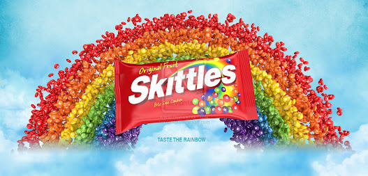
2) What is the USP (unique selling point) for Skittles and how do you know? Does the advert use any of persuasive techniques listed above?
Their picture is eye catching becauce it got different colours going on and there is rainbow ,this would make little audience interested in this piece of candy.Their slogan is 'taste the rainbow' this makes the audience more intersted because all the colours that they are using are from the rainbow.

Comments
Post a Comment